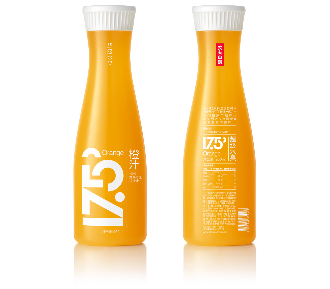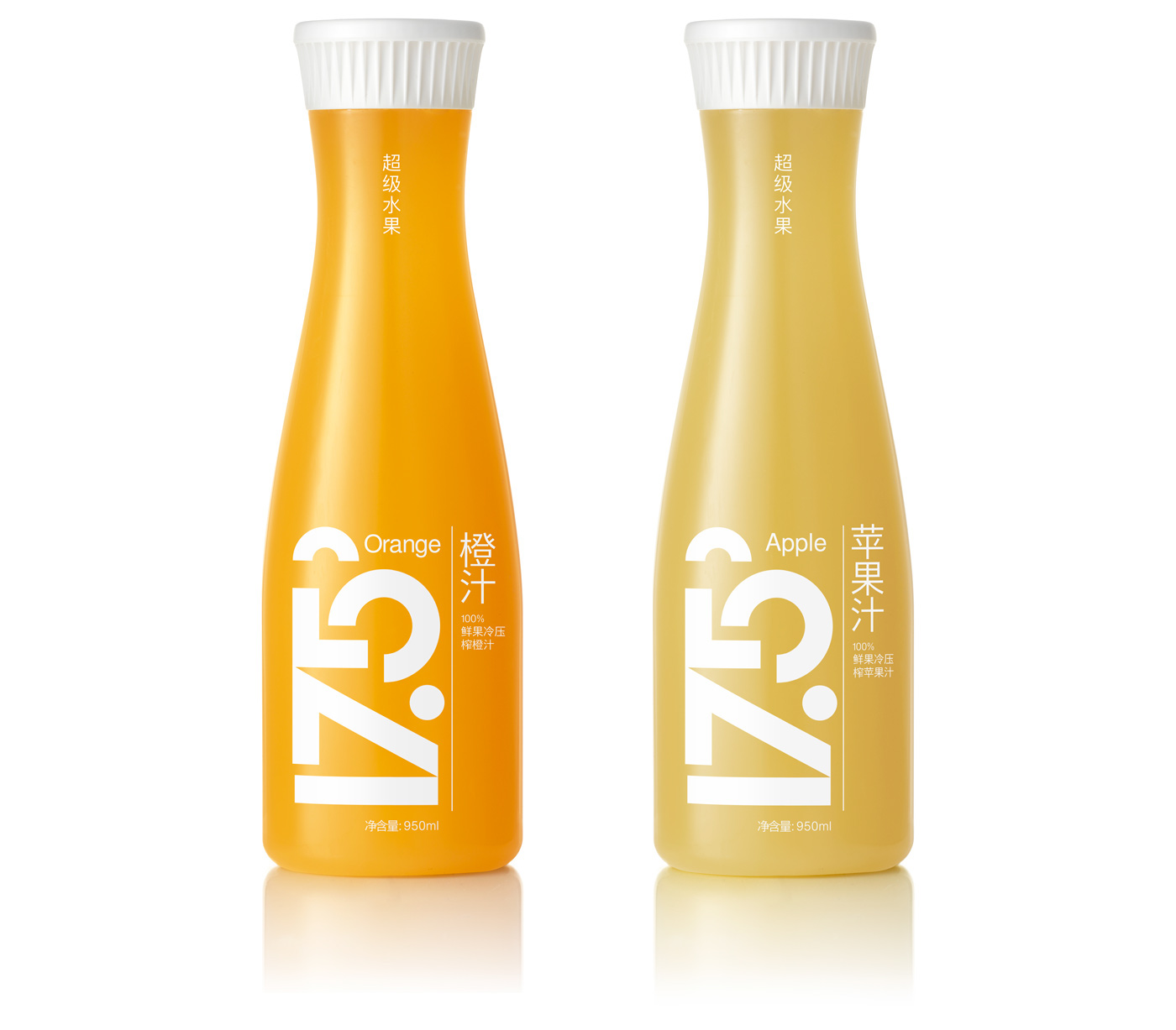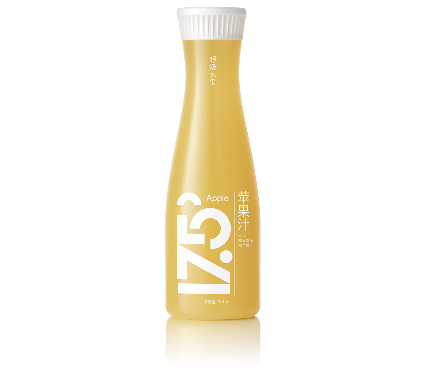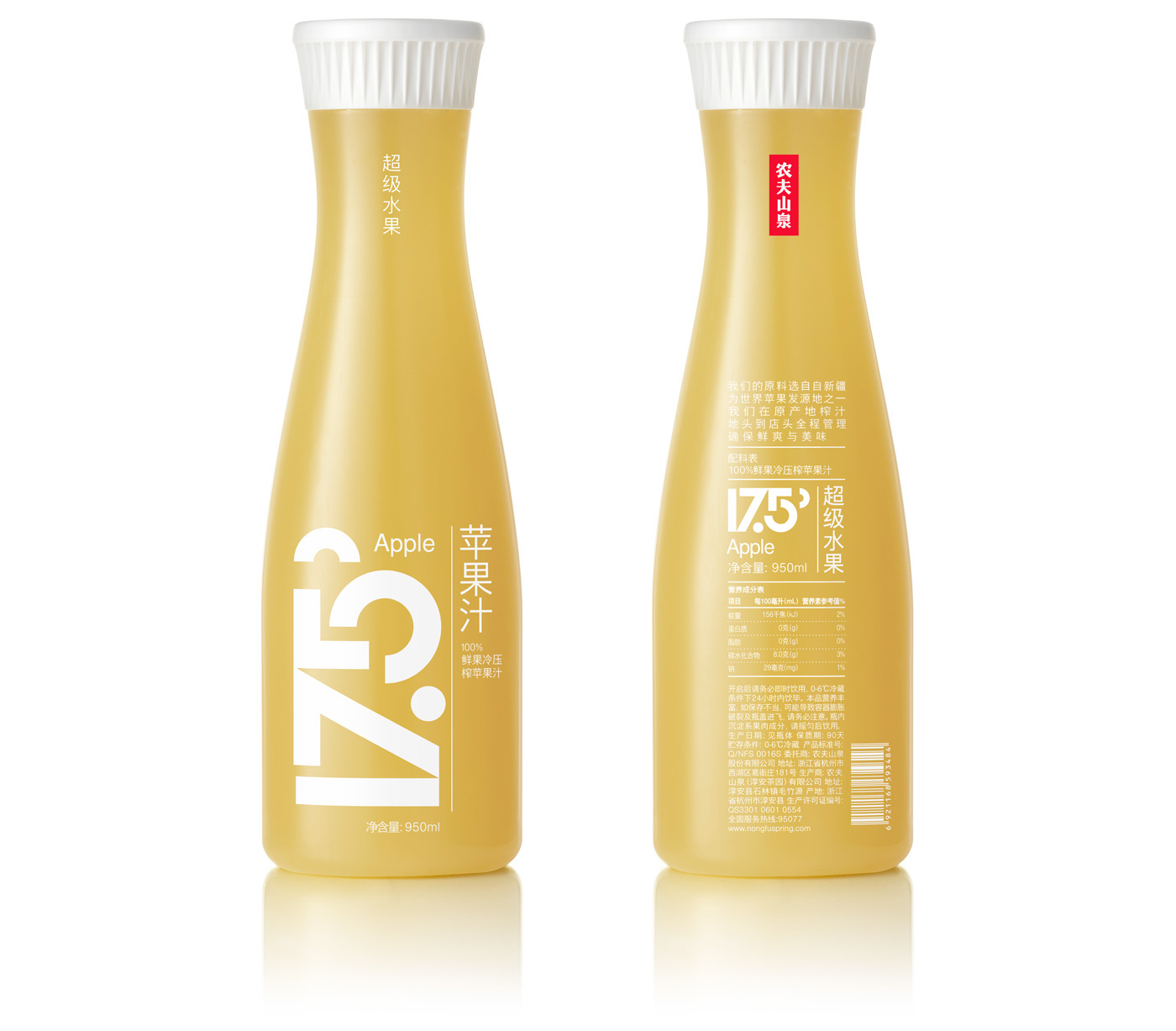


Logo and packaging design for “17.5°”, a new series of Orange and Apple juice products intended for the China market, produced by “Nongfu Spring”, the leader in food and beverages of China.
______

The Design Solution
“17.5°” is used to describe the ideal RSS (Ratio of Sweet and Sour) in client’s orange and apple juices. We used a simple, bold, equal - width typography in order to better imprint and aesthetically ‘stabilise’ in the mind of the viewer the product name “17.5°”. The ideal balance conveyed by the RSS ratio pronounced with this number is extended to the balance of letters and the overall form. The Semi circle visualises the 0.5 part of this numeric index and ingredients proportion. If the name “17.5°” is triggering consumers' curiosity through abstraction and toward easy recollection, the design attempts to reinforce the process with the body and weight of a dominating logo. Clear pet material is used for the container so that the natural juice cover serves as the backdrop of the product name.

17.5° 苹果汁
Dimitris Papazoglou
Logo
and packaging design for “17.5°” a new series of Orange and Apple
juice products intended for the China market produced by “Nongfu
Spring” the leader in food and beverages of China.
扫描二维码分享到微信